Brian Twede is a commercial photographer and I chose him because, again, I wanted to look at something different. I can't save any images from his site, but you can go there and peruse yourself http://www.twede.com/gallery/other/
His images are bright, clear and obviously commercial. Some of them are cheesy, but they are for ads and brochures. I'm curious to see them as he took them, not the final product.
The food images are good, but I feel like I'm at Denny's looking at a laminated menu when I see them. I prefer the images done by Jennifer Silverberg, an artist who came to our classroom that blogged about previously. Her food images are more organic and actually make me hungry, for real food.
He has some Halloween images that I find appealing in an odd and can't really explain it kind of way. They are a little soft on the edges, which I typically see with baby pictures, but he did it on "scary" items and it has this weird but attractive quality. Those are the images I stared at the longest, trying to figure out how he could have done the lighting.
I also like reading the "bio" on photographers websites. I had to write one recently for my blurb book and it was harder than most essays I've done. And I like to see how photographers "sell" themselves on their website. Some are well written and some are desperate. Twede is in the middle. It felt more like a sales pitch and a plea for business. It wasn't bad, just more commercial than most I've read. Which is fitting because he shoots commercial...
Friday, November 30, 2012
Graham Mitchell- artist
Graham Mitchell is a fashion and editorial photographer. I chose him because I was tired of looking at documentary work and the traditional family/wedding/portrait work. He does some editing work too and my favorite is the police chase. Its funny, but I like the quality of the image. It has movement and the dark color gives it a criminal feel.

I dont know if this image is authentic or not, but for whatever reason I cracked up when I saw it (its late at night so maybe its one of those Monty Python Holy Grail kind of moments).


his website http://www.graham-mitchell.com/


There wasn't a lot of fashion photos on his website but these 2 represent very different styles of his. The second one reminds me of the work that a classmate, Rachel, does.


his website http://www.graham-mitchell.com/
Wednesday, November 28, 2012
Hungry Planet- artist/book
My photography professor, Kate, loaned me this book to flip through and I am just loving it! It's called "Hungry Planet", by Peter Menzel and Faith D'Aluisio, and its about what families around the world eat, how they cook it, the space they cook and eat in, etc. I love exploring food from other cultures and I often have phases of what country I am trying out. Steve will be home in 3 weeks and Afghani food will probably be my next phase...
But anyways, this book was an eye opener for me. I think I had a more glamorous vision of where some of this food I am trying out comes from than what is reality. The authors made a point regarding the gluttony of Americans compared to other countries. As I look at the images, read the notes, and see the cost comparisons I am ashamed of how much we waste here. I have taken the opportunity to make a variety of food and eat in abundance for granted. I have a big clean kitchen (most of the time) to cook in, proper storage methods and I don't have to eat off the floor. I am seeing food in a whole new way...
As far as the images go, they are documentary in nature. They aren't meant to be creative, but informational and they do a great job serving that purpose. That doesn't mean they are dull and don't have any character, because the photographers have done a superb job in the details. Some follow the same format so there is a smooth flow through the book, but there is variety within that format that draws the eye in. The images are colorful and clear (some are a bit hazy but that is from the nature of the environment). I like the images that show the environment the families live in because that tells me a lot in addition to the food itself. I also like the portrait work of individuals gathering food, cooking and eating. There is a lot to enjoy and I'm adding the book to my wish list.


Wednesday, November 21, 2012
August Sander- artist
A fellow classmate, Connor, has chosen August Sander as his inspiration for his final project. I have seen Sanders work when Connor brings it in and I always find myself wanting to see more. So I'm getting off my horse Procrastination and looking him up. Like my last artists, he is German. I'm sensing a theme....(maybe because a few weeks ago my husband asked me about moving there?). Anyways, "Early in his career, perhaps after tiring of prizes that were too easily won, August Sander set for himself a problem that ranks among the most ambitious in the history of photography: He assigned himself the project of making a photographic portrait of the German people. He set about his task as systematically as a taxonomist, gathering, specimen by specimen, exemplary players of the roles that defined German society. Hod carrier, gamekeeper, confectioner, student, functionary, industrialist --- piece by piece Sander collected the elements for his composite portrait... Sander, however, was a very great photographer. His sensitivity to his individual subjects --- to expression, gesture, posture, costume, symbol, habitat --- seems unerringly precise. His pictures show us two truths simultaneously and in delicate tension: the social abstraction of occupation and the individual soul who serves it... Sander was a professional portrait photographer, but many of the subjects for his great project surely did not pay him. Some doubtless could not, and others, if paying customers, would have expected to be shown less fully revealed. In his professional role he must have made safe and routine portraits, but there are none among the two hundred or more of his published works.On the evidence of these pictures, it would seem that he found every station and every individual of consequence." http://www.atgetphotography.com/The-Photographers/August-Sander.html


I know that was a long quote, but someone worked hard to write all that and did a great job so I'm not going to mess it up with a summary.
He was a great black & white photographer, another reason I am interested in his work. He didn't have the option to choose B&W or color, or film or digital. But I wonder what he would choose if he did have the choice? Removing the color takes some distraction away from content you don't want the eye drawn to, as well as keeping the focus away from where you do want it. I don't know if that is making any sense, its late and I'm up waiting for my husband to call from Afghanistan! But I appreciate Sanders careful consideration of what else went into the frame, beyond the person. Thats been a matter of conversation regarding Connor's images for his project. I have been asked to take portraits and its always at the park or in a "studio" but what I want is to take them in their own environment. If you really want your portrait to be about you it should give some hint to your personality and standing in front of a black drape reduces that.

The Bechers- Artists
My teacher mentioned this duo that photographs architecture. I found the following info on a website http://www.moma.org/collection/artist.php?artist_id=8095

"German photographers. Bern(har)d Becher (b Siegen, 20 Aug 1931) served an apprenticeship as a decorative painter in Siegen, then studied painting and lithography at the Staatliche Kunstakademie in Stuttgart (1953–6) and typography at the Staatliche Kunstakademie in Düsseldorf (1957–61). There in 1959 he met Hilla Wobeser (b Potsdam, 2 Sept 1934), who had trained as a photographer in Potsdam and, after a period as an aerial photographer in Hamburg, had moved to Düsseldorf in 1957. They married in 1961. Together they developed a documentary approach to photographing their industrial surroundings that introduced new kinds of social, cultural and aesthetic questions about the increasing destruction of many late 19th-century buildings. They systematically photographed half-timbered houses, cooling towers, water towers, blast furnaces and derricks of the same or similar design, forcing the viewer to compare and judge the buildings from unfamiliar aesthetic standpoints. This photographic documentation was not based, however, on a system of encyclopedic thoroughness, nor on a theory of objectivity, but primarily on the desire to express their own social and political views. For this reason, they excluded any details that would detract from the central theme and instead set up comparisons of viewpoint and lighting through which the eye is led to the basic structural pattern of the images being compared. This principle, which is allied to the philosophy underlying the New topographics movement, is most obvious in the two published series, Anonyme Skulpturen: Eine Typologie technischer Bauten and Typologien, Industrieller Bau, 1963–1975, in which the images are contrasted in groups of three. Their work was also published in Die Architektur der Förder-und Wassertürme (Munich, 1971). In 1977 the Bechers began teaching at the photography department that they set up at the Düsseldorf Kunsthochschule."
Their work is very clean and consistent in composition and lighting. I don't know much about German weather, if its pretty constant (unlike here in Missouri). Maybe they were just very particular about the time of day and lighting conditions they shot under. That was something my teacher recommended to a classmate who was shooting buildings for his project. It got me thinking about my project, which I can't control in that manner. I have to take the moments as they come and make the best out of it, but how can I find consistency in uncontrolled environments? That is the question I ponder as I look at the Becher's work.

Friday, November 2, 2012
Arnold Newman- Artist
So now I have the "right" Newman....Arnold Newman.
Taken from the website http://www.arnoldnewmanarchive.com/ "Generally acknowledged as the pioneer of the environmental portrait, he is also known for his still life and abstract photography, and he is considered as one of the most influential photographers of the 20th Century." So its no wonder Kate wanted us to study him!
I like his early work because the detail is good (I'm always impressed with someone who knows how to manually use a film camera and make it look good) but there isn't anything compositionally "wow" for me. He did a great job documenting with his images and while it may not be artistically creative, its important to history. The following picture is small because its the only size I could save, but see it bigger and more images on his website.

His portrait work isn't like most. He includes the subjects environment (hence the comment "pioneer of the environmental portrait), which adds another dimension to the image. You see the person, but then you see where they live or work, what they love or makes them happy, how they dress, and the time period. Some are in color and I can't say I have a preference for either. When it comes to stuff, color can add or subtract from the person and Its subjective. I'd like to see an image in each and then determine which works better. My teacher also likes "peoples stuff", so I can see why his work appeals to her (and to me, I'm a bit curious in that way too).

Inside the Shoot is my favorite tab from this website. I love to see how photographers set up their photo sessions. I want to know just how complicated or simple the process was, where lights and people were located, and try to learn from the environment. And even though I take pictures and know what you don't see in the picture, its still cool to see his image in the full environment it was shot in and as it was viewed (in magazine, paper, etc.).

Taken from the website http://www.arnoldnewmanarchive.com/ "Generally acknowledged as the pioneer of the environmental portrait, he is also known for his still life and abstract photography, and he is considered as one of the most influential photographers of the 20th Century." So its no wonder Kate wanted us to study him!
I like his early work because the detail is good (I'm always impressed with someone who knows how to manually use a film camera and make it look good) but there isn't anything compositionally "wow" for me. He did a great job documenting with his images and while it may not be artistically creative, its important to history. The following picture is small because its the only size I could save, but see it bigger and more images on his website.
His portrait work isn't like most. He includes the subjects environment (hence the comment "pioneer of the environmental portrait), which adds another dimension to the image. You see the person, but then you see where they live or work, what they love or makes them happy, how they dress, and the time period. Some are in color and I can't say I have a preference for either. When it comes to stuff, color can add or subtract from the person and Its subjective. I'd like to see an image in each and then determine which works better. My teacher also likes "peoples stuff", so I can see why his work appeals to her (and to me, I'm a bit curious in that way too).
Inside the Shoot is my favorite tab from this website. I love to see how photographers set up their photo sessions. I want to know just how complicated or simple the process was, where lights and people were located, and try to learn from the environment. And even though I take pictures and know what you don't see in the picture, its still cool to see his image in the full environment it was shot in and as it was viewed (in magazine, paper, etc.).

Tuesday, October 30, 2012
Jennifer Silverberg- artist
We had a 2nd guest speaker come to our class last week (yes, I should have written about her sooner but I'm busy!) and she was wonderful! She was extremely engaging and her work is fantastic. She is currently doing freelance photography, but a lot is food photography, which interests me for obvious reasons ( I LOVE to cook in case its not obvious). So many of her photos I recognize from local editorial pieces that I peruse in restaurants and when I was managing the Gumbo Shop. Just now I went to her blog and saw the pieces she made about an underground restaurant. I remember seeing them in the article and thinking how cool they were. I remember thinking how tough it must have been to photograph there because its dark and underground. So yeah I'm on cloud 9 because I actually met her!
Jennifer is also a "self-taught" photographr, which is an inspiration to me. The opportunity to meet Jennifer and see her work has made me more passionate about photography. Maybe when I am done with school I can look into an internship with someone like Jennifer Silverberg!
I'll post a few pictures from the underground restaurant, but look at her blog or website for more!
http://jennifersilverberg.blogspot.com/
http://www.jsilverberg.com/

She has also done amazing work for River Front Times (see her bio for details) and you can see her photos here:
http://www.riverfronttimes.com/related/to/Jennifer+Silverberg/
Friday, October 19, 2012
Paul Gregory Newman- Artist
So in class this week our teacher mentions Paul Newman as one of those photographers "you have to know about". I googled him and I got pages and pages of the actor/humanitarian Paul Newman, but I didn't think that was the right guy. I added photographer to his name and found his website www.paulnewmanpictures.com
His bio is "coming soon" and I can't find anything else about him online, so I have nothing personal to share about him. And maybe its just because I'm technologically challenged, but his site is hard to navigate and there isn't much on it. He does black & white and there is a body of work about "Bikers for Christ". I admit I have a bit of an amusing opinion of them. I'm not going to get religious on my blog, but I find the concept insincere and mocking Christ. I choose to laugh at it instead of getting offended. Looking through Newman's images of one particular group I was pleasantly surprised that they seemed to be serious about it. The perspective that Newman chose to photograph shows a softer side of bikers and I especially liked his images of their hands, simply placed on someones back while they pray.


The images are also very detailed, which I find worthy to mention because they are in black and white and of people who wear a lot of black. I have never used a black and white camera, but its not as easy as I thought to take a digital color image and make it black and white and keep the detail and balance of shadows and highlights. I need some practice and Newman's images are a good example of what I can aim for.
Monday, October 8, 2012
Matt Clark- Artist
I was looking for disaster photos to help me in my final project (CERT photo book) and found Matt Clark. He's not a "disaster" photographer but he has a flickr account with lots of storm, cloud and landscape images.
http://www.flickr.com/photos/33980086@N06/
* I don't have any examples of his work because they are protected
I have always been fascinated by tornadoes. Its more of a love/hate relationship...I am in awe at the complexity and power of a tornado but when the sky gets dark and the sirens go off I am in panic mode. I love watching those storm chaser shows but I hate that I hope they filmed a "good" one because it usually means people were hurt, killed or lost everything. Joplin was devastating and I pray a tornado like that never hits near my home. But I just can't deny the curiosity of seeing a tornado.
There are also images of lighting storms. I remember seeing an image of a lighting strike in my great Uncle Bobby's garage when I was a teenager and staring at it wondering how in the world he got that picture. He must have been pretty lucky to have taken a picture just as it was striking. It had an usual arch, from what I can remember. Knowing a little bit about night photography now, I am still amazed he took that image. I wonder if its still hanging in his garage. I would ask him if it is and how took it but he passed away a few years ago. It makes me sad because its the first image I can remember looking at and thinking how cool it would be to become a photographer. So thanks Matt Clark, for reminding me of a sweet memory of my Uncle.
Matt also has images of fire. Thats purely a hate thing for me. I remember waking up in the middle of the night at age 12 to the sound of loud booms, like gun shots, caused by a neighbors gas cans exploding. Their son tossed cigarette butts in the corner of the garage and it lit the house on the fire. We stood on the corner, in PJ's and bathrobes and watched it burn down. No one was hurt, but I had nightmares after that for months and months. And then as an adult, when I lived in Redlands, CA, there were devastating fires in the mountains behind us (Highland, San Bernardino) for days and days. We weren't in danger of the fire, but the smoke poured down the valley and covered the freeway. The air was thick and dark and filled your lungs. So many people lost their homes. I worked in a restaurant and met some of those people and it was heartbreaking. I have a picture that I took from my church parking lot of the mountains on fire, but its not digital so I dont have it right now, but I found the one below which is similar. Those aren't so sweet memories! It scares me to think my children could be trapped by a fire or we could lose all of irreplaceable photos because of fire. I'm thankful to be able to cook my meat and stay warm, but other than that I hate fire.

Lastly, he has snowy images of Exeter and other places that remind me of my childhood in Idaho. The wind would blow in Rexburg, creating huge snow drifts my brothers and I would turn into snow forts. It was so much fun and I cherish those memories! Now all we get in St Louis are ice storms and when it snows we have to gather all the snow from our yard and the neighbors just to make a snowman. Hopefully my kids will remember it with fondness...And there's just something refreshing and pure about the world right after the snow has fallen. All the yuckiness left after fall is covered up and it feels untouched. Its what I love about the snow.
Matt's images certainly evoke a lot of memories for me, but they are also great from a professional point of view. They are clear in the details and the coloring is spot on. It can be hard to get a great image in a storm because of the lighting, the scene changes so quickly and you can "lose the moment", its often rainy and its not safe to be setting up a tripod when a tornado is forming! And lightning is hard to predict and requires a lot of patience and luck. His snow images aren't too bright or washed out. He includes enough detail to make it more than just an image and I like the variety of his scenery.
50 Unexplainable Black & White Photos
I'm not entirely sure how I came across this, somewhere in my search for black and white photos, but it made me shake my head and laugh so I thought I would share
http://www.buzzfeed.com/mjs538/50-unexplainable-black-white-photos

I'm not sure I want to know....
Why do I find these amusing? Maybe I shouldn't be looking for photographers to blog about at 11:00 pm! It's like watching Monty Python at night because its not as funny during the day when you are at full mental capacity.
Oh and in case anyone is wondering, Napoleon Dynamite is never funny.
Anna Marie Stepney- Artist
I found this photographer on "diary of a vintage girl" blog. She helped with a vintage wedding photoshoot. Her website is http://www.annamariestepney.co.uk/
She does engagements, weddings, families, portraits, babies, maternity....the usuals. But I choose her because her images are different than most in those categories (except for the engagement photos). I feel like I know some of her clients personalities just by looking at their photographs. And I appreciate that she shows more than just the "pretty" images of the bride and groom; she shows the guests laughing, dancing, giving a toast. Sometimes they have a goofy expression on his/her face, but those moments are real and shouldn't be forgotten by the bride and groom. There's a lot that goes on at a wedding that they don't get to see and I think its fun to at least see them in the photographs later.
I also like her mix of color and black & white, within the same event. She chooses the appropriate one for the image and it looks nice as you scroll through.
What I didn't care for are the higher angle shots of couples. They aren't flattering or appealing. A less dramatic angle would have worked better.
As mentioned above, the engagement photos weren't too unusual, although I did like some of them. I personally believe engagement photos should represent the couple- their personalities as a couple and/or individually. They should also reflect something about the couples style and possibly the theme of the upcoming wedding. Its a great way to give a little bit of info about the bride or groom to someone who doesn't know one of them.
Overall, I enjoyed her gallery and can't wait to see what else she does.
*I wasn't able to save any of her images to post on the blog so you will have to visit it yourself to see them!
Thursday, October 4, 2012
Our story in 2 minutes
Here's a very quick moving slideshow of images telling the worlds story in 2 minutes (shared by my mother-in-law):
Its a cool concept and the images are great, although I don't believe humans evolved from apes. Its funny there is actually a painting of Adam and Eve in it! But despite the difference in belief it is a cool video.
Its a cool concept and the images are great, although I don't believe humans evolved from apes. Its funny there is actually a painting of Adam and Eve in it! But despite the difference in belief it is a cool video.
Monday, October 1, 2012
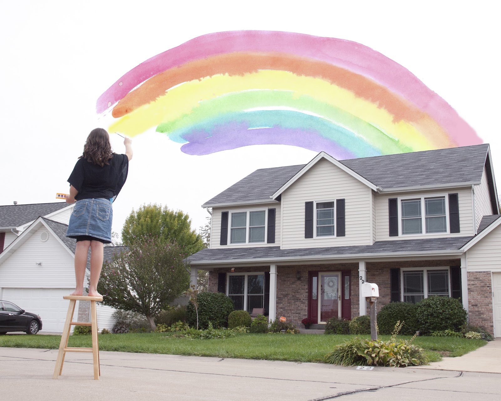
Nana's Rainbow
For my first Photoshop Fx assignment I got my inspiration from a couple things:
1) an artist presented by another group in class, Ben Heine, who combines photography and hand-drawn images
2) seeing double rainbows behind my house a few days ago as I pulled into my driveway
3) my love for my children's artwork
I combined a photographic image of my daughter "painting" the sky and a watercolor rainbow she created. I made one in all color and one in grayscale, with only the rainbow in color. I'm not sure which I will show in class...maybe both!
There are lots of ideas for using their artwork bouncing around my head right now! This could be my next blurb book idea.

Sunday, September 30, 2012
Some cool Photoshop websites
These are some links fellow photo students shared in class about Photoshop (CS5):
http://photoshoptutorials.ws/
http://www.photoshopstar.com/
http://www.tricksdaddy.com/?s=photoshop+tutorials
We have a "photographic Fx" assignment coming up this week that I am working on and I am not familiar with Photoshop, so this should be interesting.....
(Will post work as I complete it)
http://photoshoptutorials.ws/
http://www.photoshopstar.com/
http://www.tricksdaddy.com/?s=photoshop+tutorials
We have a "photographic Fx" assignment coming up this week that I am working on and I am not familiar with Photoshop, so this should be interesting.....
(Will post work as I complete it)
Friday, September 28, 2012
Edward Thompson- artist
For my final project I am constructing a blurb book about the volunteer organization Steve and I serve, called CERT (community emergency response team). One of the questions in my proposal I didn't really have an answer for: What artists have worked with a similar theme or approach? My teacher encouraged the entire class to find other bodies of work with similar concepts that we can learn from.
I spent some class time looking and found Edward Thompson, based in England. His website is edwardthompson.co.uk.
He does documentary work on a variety of subjects and themes. Most of the documentary photographs I had come across did work in third world countries, about the sick, and traveling the world. Their work is fantastic and I can definitely learn from them, but Thompson's images are more appropriate to what I am doing and I hope to apply some of his technique to my work.
A few of things I made note of regarding his work that I can relate to my project are:
There is detail in the background, but the eye is first drawn to the subject, then your eyes naturally look around the image. Sometimes he does that with a slight change in the focus, with color or light, or with movement within the image.


There is good movement it adds to the image, so its not just a picture of something or someone.


He used his fill flash at night which I sometimes am afraid to do, but I can see it worked in his images. It was the only way to get some of the images he took!


He chose a higher vantage point to get detail in a large room, something I was just struggling with last week at a CERT meeting.

His descriptions of each body of work are really interesting and compelling. After reading about the "Re-Home" I wanted to buy one of the hens! I hope that a combination of my images and text can compel my viewers as I'm hoping (you'll have to wait for my project to know what that is).

Some of the images aren't of a pleasing subject, but are necessary to tell the story. This is something I learned from other photographers work as well. And sometimes they aren't technically perfect, but can still add something to the story (other photographers).

I also found on Thompson's website a reference to another blog created by a woman who loves vintage clothing (http://www.diaryofavintagegirl.com/). I'm not into vintage but I liked the photography from a documentary viewpoint. I just might include it in a later artist blog....
Thursday, September 20, 2012
Foundry
Today we went to the Foundry Art Center in St Charles as a class. You're never too old for field trips!
It was a struggle to get there because my 6 year old was sick and I had to find someone good enough to watch a vomiting child for a few hours. I have the best neighbor in the world! And I was exhausted from being up all night with him...
But it was a great experience (the Foundry, not the vomiting). Its an old train car crash testing site from the early 1900's. Its been restored to a contemporary design. They have a large gallery for traveling exhibits and a few smaller galleries, like one for local children's artwork. And upstairs are working artist studios. They have classes and story-telling, and even lunch from Spiros on Thursdays...lots of great stuff!
My photo 2 class was privileged to be the first to see the Andy Warhol exhibit that begins Friday night. I am not familiar with him but I learned a little bit today and just might make him my next artist blog, or his photographer. The curator explained a little bit of the process of preparing for the exhibit and I was feeling a little interested in volunteering at the gallery. Then I remembered how little time I already have...
Upstairs was my favorite part. The studios are used by local artists for different mediums. The front of each studio is all glass so you can see them work. Only a few artists were in their studios during the time I was there. A fellow student, Zac, walked around a few of them with me and we got to talk to 2 painters. One gentlemen paints landscapes, including barns, and he had some really great pieces. If only I had $1500! His studio mate does watercolors and has a printing press he designed and built himself (with his dad). His style is very different from his studio mate's, but really interesting in his own right. Another studio was for bronze work, but no one was there. I'm dying to go back to meet the artist in that studio and ask about their process. Sounds like a fun date night idea....
Light Studio Demo
 We got to set up a mock light studio in class and it really helped ease the overwhelming feeling I had experienced. Its simple in nature, but there are lots of details regarding bulbs, reflectors, backdrops, light boxes, etc. I'm excited to set up my next "studio session"!
I thought it was a precise process, but I learned you can do anything with the lights. Where you place them alters the feel of a photograph, but its entirely up to the photographer to determine where the lights go.

http://itunes.apple.com/us/app/scott-kelbys-lighting-recipes/id499033559?mt=8
I really liked my teacher's favorite, the "clamshell". I tried to take a picture of it...

There is a soft box light above her head and one below her face. You have to get in between them with the camera.
This is the picture I got using the clamshell method (Debbie wasn't wearing makeup today and she was embarrassed but I think she's still beautiful).
I learned a lot about the strobe and model lights. I learned to NOT put the subject right in front of the backdrop, unless you want to see all the wrinkles! We learned about slaves and my "gotta try that" (aka gotta buy that) was the ability to connect to a laptop and see the image right away (you can see Kate's laptop on the stand). The benefit is the picture is accurate, unlike how you see it in the camera viewfinder. You know right away what the image looks like and can make adjustments. No more hoping you got a good shot.
Thanks Kate for showing us this!
Monday, September 10, 2012
Frans Lemmons- artist
So apparently I am totally into travel photography because that is what is appealing to me right now. And I found a new favorite photographer! Her name is Frans Lemmons (website: www.franslemmons.com) and her images are amazing!
I loved the work by Steve McCurry, still do, but I am in love with Frans' work. First of all, I am totally jealous of the traveling she gets to do. And she seems to be able to get into these cool places, mix right into local culture and get great shots. Being able to communicate and settle right in with people is a great skill for photographers, one I need to develop. She must have interpreters, but even so body language is a big factor. Anyways, she must have amazing people skills!
 So this is my favorite of her landscape photos (Iceland). I am obsessed with getting the water soft and flowy like this and it takes patience and skill to do it right. I know because I have tried and have only been slightly lucky. Having a tripod is essential too....
 This is my favorite of her people images because I'm a mom and I loved moments like this with my kids when they were little. Look at how happy she is, despite having very few clothes and carrying this huge sack on her head. It reminds me that we are all children of God and being a parent is a special privilege and source of joy, no matter where we live or what our circumstances are.
 I like this image simply because its so freaking cool. How often does this happen and you're there with a camera? The colors are vibrant and I love the horse especially. He almost looks fake. And I just want to know where they are and why they are in the water. If a picture makes you wonder, its a story.
I may not get to travel much, but I am surrounded by people and they have a smile to share and a story to tell, I just need to figure out how to get it out of them. Frans Lemmons is one of the few people I would love to meet and ask "how did you do it?"
I loved the work by Steve McCurry, still do, but I am in love with Frans' work. First of all, I am totally jealous of the traveling she gets to do. And she seems to be able to get into these cool places, mix right into local culture and get great shots. Being able to communicate and settle right in with people is a great skill for photographers, one I need to develop. She must have interpreters, but even so body language is a big factor. Anyways, she must have amazing people skills!


I may not get to travel much, but I am surrounded by people and they have a smile to share and a story to tell, I just need to figure out how to get it out of them. Frans Lemmons is one of the few people I would love to meet and ask "how did you do it?"
Wednesday, September 5, 2012
Tom Young- artist
I found the name of Tom Young while researching Eve Arnold and wrote down is name in my "artists to blog" notes. Today I found his website and went right to his portfolio and went "aahhh!" Maybe having a sinus infection right now is partly to blame for that reaction? HIs images made me feel dizzy and nauseous. They are fuzzy and hard to make out.

I thought "what is the deal?" Being a some what smart person I concluded he must have a reason for his approach so I promptly looked for his bio or artist statement. On his website http://tomyoungphoto.com under "statement" it reads:
"When I was ten years old I went through a medical procedure that left my eyes fully bandaged for weeks. I remember well two things about that experience -- without sight my other senses changed greatly, and the darkness became somewhat familiar and at the same time fearful. I had heard that people who loose their sight acquire heightened remaining senses, and I was fascinated by this prospect. I would imagine visions of the world around me, often with areas merging into the darkness of my closed eyes. Saltine crackers were the only things I wanted to eat because their distinctive taste clearly matched my memory of them. Everything else tasted different, suspect. I liked to lie in the grass with my face burrowed into the earth. The quiet assumed a different nuance, both hollow and sumptuous. Certain sounds embraced the darkness, like the sound of the wind or water moving, something fundamental and solitary.
The photographs I have been making for the past thirty years are in part informed by a remembrance of that experience. The places I'm attracted to engage my senses in ways similar to those of the ten year old boy in bandages. I go out into the world to places where I sense something of meaning has once occurred and lingers. While photographing I feel out of time, blinded from my everyday life. I'm looking both out into the world and back into self, where the world in front of me appears both familiar and mysterious."
That explains it! I can actually look at AND appreciate his art. It does still give me a bit of headache, but there's a sense of curiosity in his images. I want to look away but I also wonder what that thing is. I see what I want to see, but do would I admit what I see out loud? I wonder if he wants the image to be so open to the viewers interpretation. And when I consider his experience I think it must have been pretty scary for these images to be what he remembers.
I find some fascination in his editing. The edges are dark and rough and some images are scratched or blacked out. I think if I was trying to create a photograph of a dream I would try some of his techniques (mostly scary dreams).
Young's work is not the "type" of work I have been studying or thought I would make myself, but the wheels are turning...
Sunday, September 2, 2012
Eve Arnold- artist
So I have to play catch-up with my artist blogs because I have been crazy busy and haven't had time to sit down and blog. This post is about Eve Arnold:
Eve Arnold was born in Philadelphia, Pennsylvania to Russian immigrant parents. She began photographing in 1946, while working at a photo-finishing plant in New York City, and then studied photography in 1948 with Alexei Brodovitch at the New School for Social Research in New York. Arnold was the first woman to be nominated for membership in Magnum in 1951, and became a full member in 1957. She was based in the US during the 1950s but went to England in 1962 to put her son through school; except for a six-year interval when she worked in the US and China, she lived in the UK for the rest of her life.
Her time in China led to her first major solo exhibition at the Brooklyn Museum in 1980. In the same year, she received the National Book Award for In China and the Lifetime Achievement Award from the American Society of Magazine Photographers. In 1995 she was made fellow of the Royal Photographic Society and elected Master Photographer - the world's most prestigious photographic honour - by New York's International Center of Photography. In 1996 she received the Kraszna-Krausz Book Award for In Retrospect, and the following year she was granted honorary degrees by the University of St Andrews, Staffordshire University, and the American International University in London; she was also appointed to the advisory committee of the National Museum of Photography, Film & Television in Bradford, UK. She has had twelve books published.
Eve passed away in January of 2012.
Eve Arnold is known for her celebrity photographs, and perhaps most known for her photos of Marilyn Monroe. Arnold’s photographs of Marilyn aren't like others of her I have seen (which honestly isn't a lot because I'm not really interested). Arnold's photos of Marilyn Monroe expose the icon’s personality rather than her flesh, most of the time. I read that while many dismiss Marilyn’s intelligence, Eve didn’t. Both women knew what effect being a woman had on the world around her, and as Eve says, “We could make use of it, or we could let it be.” Eve never liked to be a called a woman photographer, just a photographer (you wouldn't say man photographer).


I found the following quote given by a fan of Marilyn Monroe and the work done by Eve Arnold, Deanna Dahlsad "If the mark of a really good novel is that you think of the characters long after the book ends, then photographs of people ought to do the same. Eve Arnold’s photos do that. Even if you think you know the people in the portraits.
And when you don’t know the people in the photographs? You long to…"
I like the photos of Monroe, but its the work Arnold did in China that I really enjoyed. They are simple images of life and I feel they are very honest and true representations. There isn't anything tragic or glorious, she took pictures of life as she saw it (from what I can tell). Its the angle and framing that Arnold chose that makes the images appealing to me. They feel natural and real and I love that. This one is one my favorites, can't really say why, but maybe its the expression on the priest, or the guy behind him hiding his face (a lot to be interpreted about why and if it was intentional), or maybe its the light coming in through the window....

I didn't find a site created strictly for Eve Arnold, but there is a lot out there if you just google her name (she has a lot of fans) I kind of wish I had chosen Arnold for my homage project!
Jay Maisel- artist
In my quest to find an artist to study for my homage assignment, I came across a print from Jay Maisel:

I have seen a lot of cityscapes but this one is phenomenal! How many opportunities does a person to get to see something like this, let alone take a picture of it? I have tried to capture moments of awe like this and I can never get it on camera just right (its one of my goals to accomplish in my lifetime). Every time I look at it I see something new. There is so much detail in the sky, in the water, surrounding the buildings...And I love the organic feel of the sweep in the cloud line and the fog. This is a picture I would make a HUGE enlargement of and put behind my couch.
Since I loved this picture of his so much I decided to look for more of his work. He has a website (www.jaymaisel.com) that gives a short bio and has some of his work, recent and past.
Here's his bio from the website: "After studying painting and graphic design at Cooper Union and Yale, Jay Maisel began his career in photography in 1954. While his portfolio includes the likes of Marilyn Monroe and Miles Davis, he is perhaps best known for capturing the light, color, and gesture found in every day life. This unique vision kept him busy for over 40 years shooting annual reports, magazine covers, jazz albums, advertising and more for an array of clients worldwide. Some of his commercial accomplishments include five Sports Illustrated swimsuit covers, the first two covers of New York Magazine, the cover of Miles Davis’ Kind of Blue (the best-selling jazz album of all time), twelve years of advertising with United Technologies, and a litany of awards from such organizations as ICP, ASMP, ADC, PPA, and Cooper Union.
Since he stopped taking on commercial work in the late ’90s, Jay has continued to focus on his personal work. He has developed a reputation as a giving and inspiring teacher as a result of extensive lecturing and photography workshops throughout the country."
As far as his work goes...I wasn't really impressed with anything else! There were a few that had some good color and composition, but nothing really moved me. This one was cute:

But after looking through all his images on his website I decided he wasn't someone I wanted to create an homage for. Although his work is good, I wasn't inspired by any of it. Maybe you'll feel differently?
Thursday, August 30, 2012
Steve McCurry- artist
"What is important to my work is the individual picture. I photograph stories on assignment, and of course they have to be put together coherently. But what matters most is that each picture stands on its own, with its own place and feeling." Steve McCurry
I chose Steve McCurry as my first research artist because of his iconic photograph "Afghan Girl". Her eyes are piercing and hold my gaze, and I wanted to know more about the photographer. I was richly rewarded to find he has created thousands of moving photographs. He has a website www.stevemccurry.com that shows a lot of his work, organized into galleries. It is also were I found the quote above. Steve was born in Philly and studied film at Penn State. He worked for a local newspaper and did some freelance work. His real story begins when he takes his first trip to India. He goes on to Pakistan and is then smuggled into Afghanistan by refugees. He is embedded with Mujahiden and hides behind a beard and local dress. In this situation his work begins to unfold.
What lures me into his photographs is the way he is able to grab my curiosity about other cultures, other countries, and hold my gaze. But at the same time I feel deep sadness for the way some of them live. There is information to tell a story yet enough missing to leave something to the imagination. We hear so many terrible things about a few of the places he has photographed in and those gaps in the story aren't filled with daises and smiles. The following picture is the one that I love and hate the most (taken in Yanesha, Peru):

Steve McCurry photographs are very rich in color and I think its a wise choice. The emotions wouldn't be the same in black & white. Color tells a lot about culture and Steve has beautifully captured that. There are many aspects to his work I admire and wish to emulate, but I don't know if I could be as brave as he was and go into these countries and focus on taking a picture. He is a remarkable artist and the following quote sums up his work quite nicely: "His work spans conflict, vanishing cultures, ancient traditions and contemporary culture alike-yet always retains the human element that made his celebrated image of the Afghan Girl such a powerful image".
I encourage you to check out his website!
Friday, August 24, 2012
Introduction
First of all, I'm starting this blog as a photo class assignment. But who knows what it will turn into! I'm not bad at journaling, I actually do it everyday, but I won't always have time for 2 journals. For right now it will be mostly about my photography journey.
I know "candy lady" doesn't have anything to do with photography, but its the only nickname someone has ever given me (other than my mother but I wish for that name to remain a family secret). I make a lot of fudge, truffles and (the best) caramels ever for my church and one day a boy returning from a 2-year mission asked his mom if the "candy lady" was still in the ward. I also make cakes and do a little catering. My latest passion has been photography but I haven't been given a nickname for that yet. So "candy lady" will have to do!
I don't have a specific moment when I fell in love with photography. It came much the same way my love for cooking did: I saw how happy it made people to receive it (food and photos) and wanted to keep sharing it. I also scrapbook and pictures are kinda important in that hobby. I wanted great pictures for the pages I was so painstakingly trimming, embellishing and glueing. So a few years ago my husband bought me a good camera and I signed up for digital photography class and away I went with another hobby! Its become my preferred passage of time, sometimes even over cooking. I'm not great, but I keep trying.
Subscribe to:
Comments (Atom)